Brand Development
Part of my work with Jobber's brand was to differentiate it from it's competitors. One key piece of our creative strategy was to position Jobber as a real life tool, not a nebulous, opaque software that blends in with the countless other software solutions on the market.
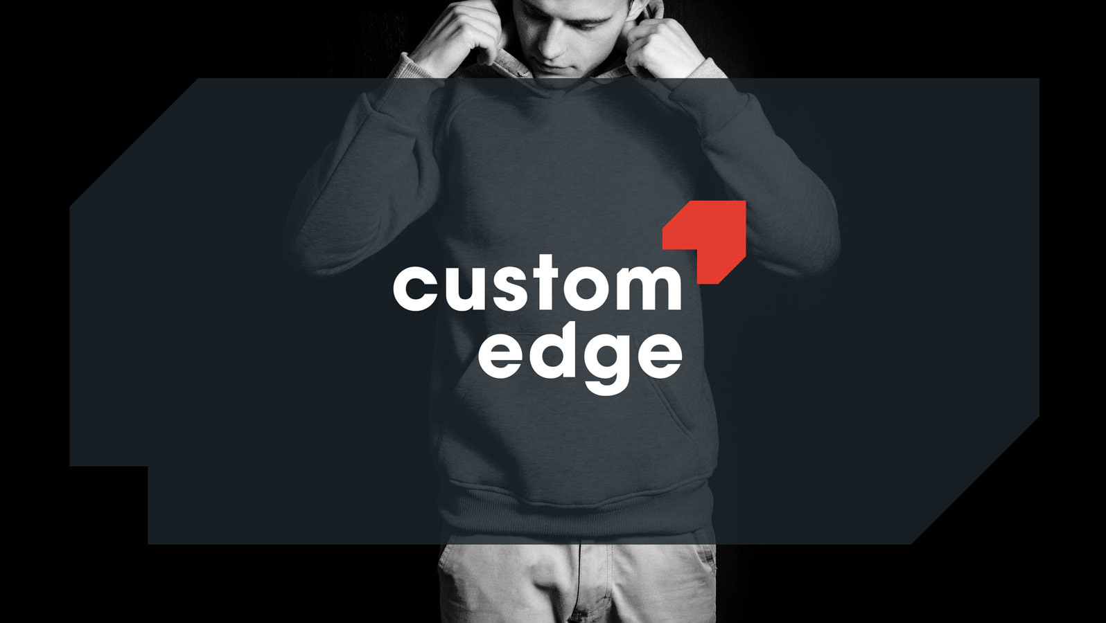
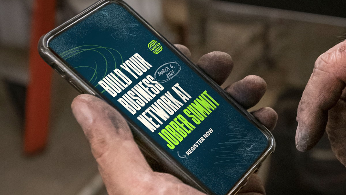
An important part of executing this strategy was to develop a system of visuals that made Jobber feel closer to its customer's everyday lives. Adding visual grit and hand-drawn elements helped break away from the pixel-perfect tech brands they're used to. We combined relatable copy and photography featuring real Jobber customers to speak directly to them in their own language. Every choice matters, like pairing Jobber creative with other brands their customers already trust, like Carhartt and Yeti, to create merch that's not only useful, but relatable.
Product Marketing Imagery
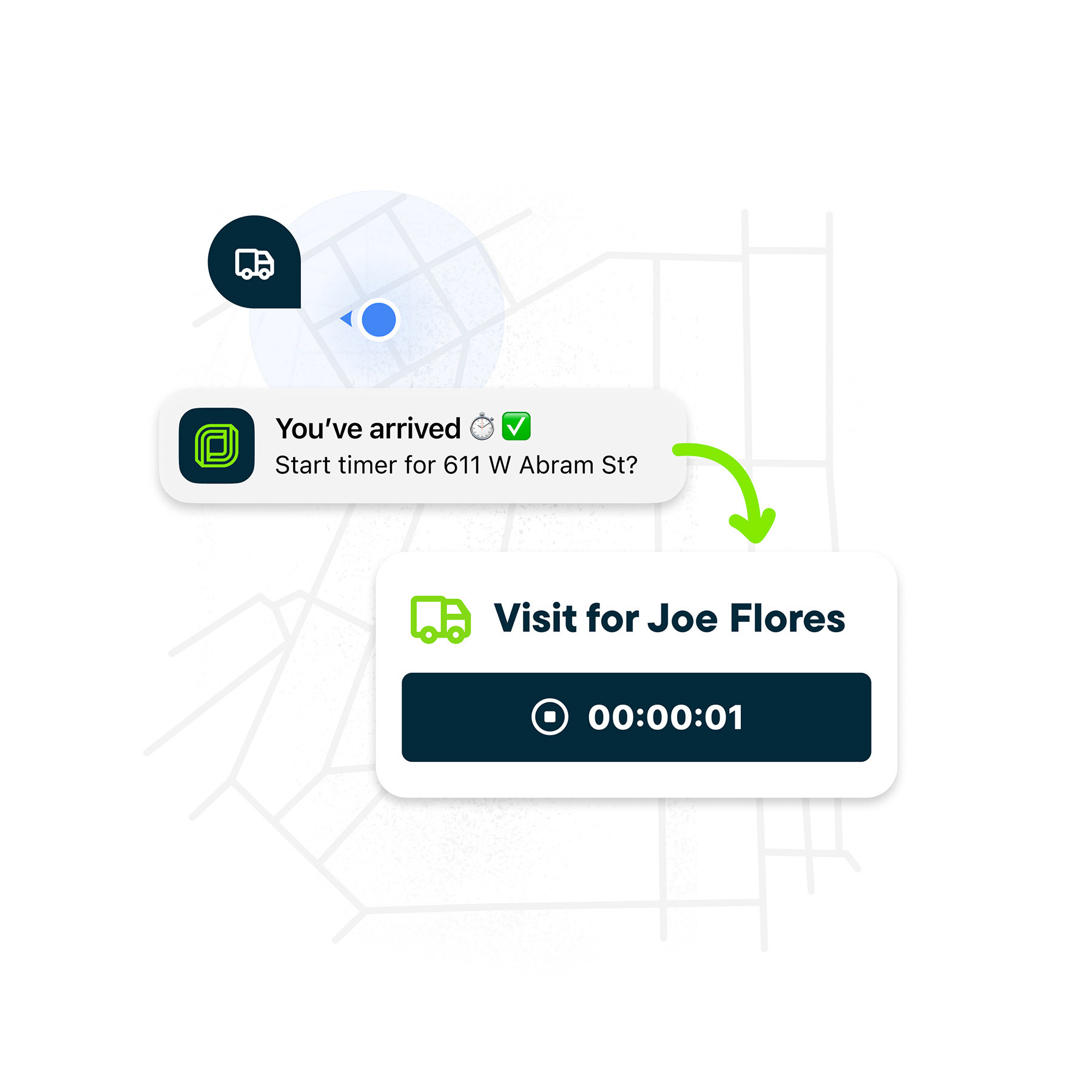
A common problem when marketing software is the fact that software is inherently complex. It does many things to solve for many problems but showing all those things to a prospective customer is very difficult, given the brief windows of attention you're given. The solution is to show the value of the product, not the exact product itself, or in other words, show the "why," not the "what."
In order to unify Jobber's product imagery, I directed a project that created a system for all future product marketing images to be built with. The system acts as a guide to give other designers all the tools they need to create imagery that shows the value of the feature, not necessarily the feature itself, prioritizes a clear message by reducing unnecessary text and elements, and adding brand elements to make the product feel more approachable and tactile.



Digital Ads
A valuable piece of Jobber's marketing strategy is digital ads, targeting specific demographics. Whether it's for brand awareness or to push a discount, the ad creative needs to grab attention quickly and deliver its message efficiently. Because these ads are constantly running, it's important to keep creative fresh, which means always exploring new visuals and messaging to test and refine.
All work completed while working at Jobber.
